Benefits Enrollment
This is a benefit enrollment application that employees can use for various types of health insurance, a 401(k), and many other plans and products. Users were struggling with the process and wanted a simplified flow that could also be accessed on mobile.
Putting myself in the users' place, I saw images like this from a user who had started but not completed enrollment using our old mobile design:
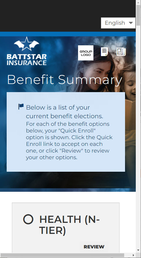
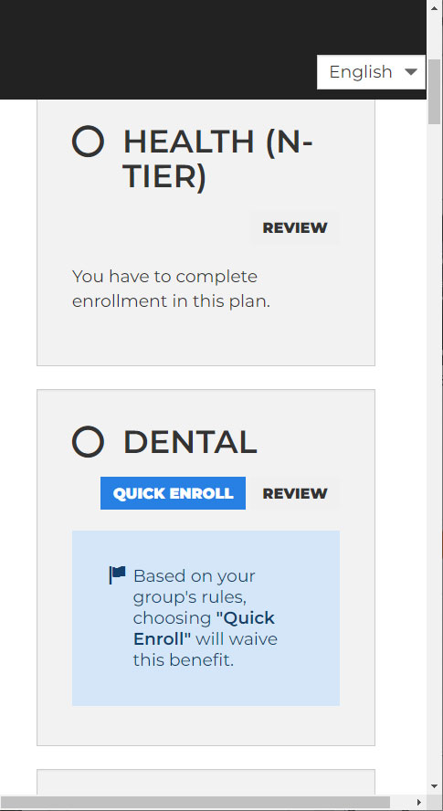
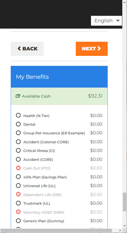
The user is greeted with a large alert box in the header and must scroll down to see all of the plans they need to enroll in or waive. The cost box is located at the bottom, after all of those plans, with the navigation buttons positioned above. Some user remarks include:
- "How can I easily see which plans I’ve waived or enrolled in?"
- "I want to see the cost box whenever I want and not have to scroll to the bottom."
- "The navigation is not easily accessible; I need to scroll down to reach it."
Taking these into consideration, I took a mobile-first approach. Designing for mobile first allows for easier implementation for larger devices. I had two ways to approach this: for users who have not started enrollment and for users who began enrollment but haven’t finished.
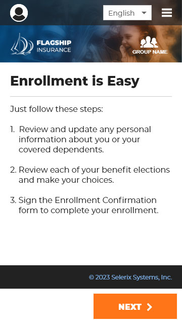
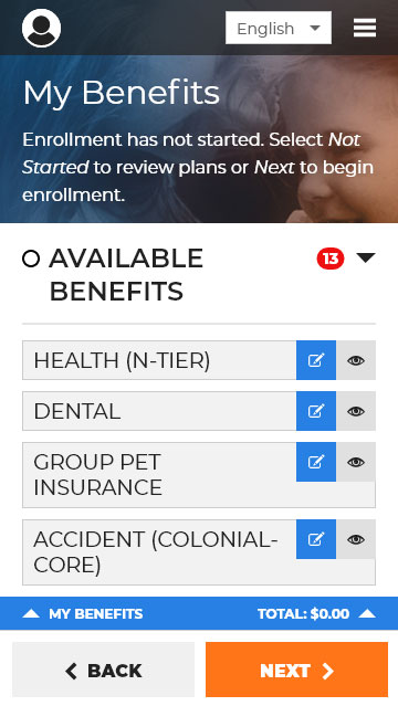
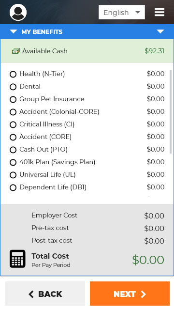
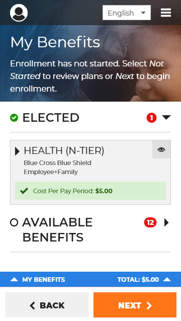
Beginning with the landing page, I aimed for a clean and simple design. Users can access available benefits and “Quick Enroll” in each plan, selecting the same plan and coverage as the previous year for an efficient experience. When selected, the cost box slides up for a full-screen view. I tried several iterations, but many disrupted the layout and did not meet accessibility standards. After confirming a quick enroll or enrolling for the first time, the user will be brought back to the summary page, where they can see all elected benefits, including the plan, who is covered, and the cost.
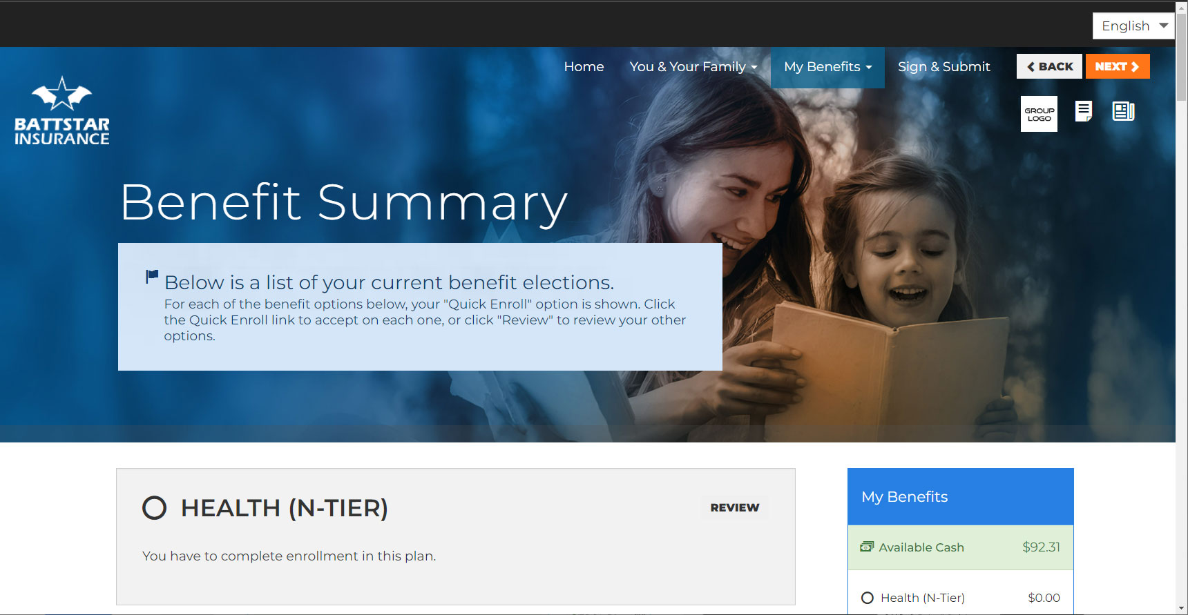
Same implementation for desktop, allowing a clean interface and if desired, a quick way to enroll in benefits. Let’s see the before and after!
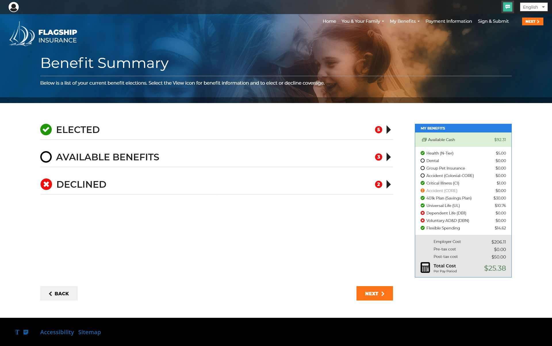
This was a fun project to work on. If I could, I would have loved to redesign the UI as well, but that would require significantly more time and effort than we had available—maybe one day! Simplifying a complicated process is always fascinating to me. This was designed many years ago and did not comply with today’s accessibility standards, so it needed a change.