Broker Portal
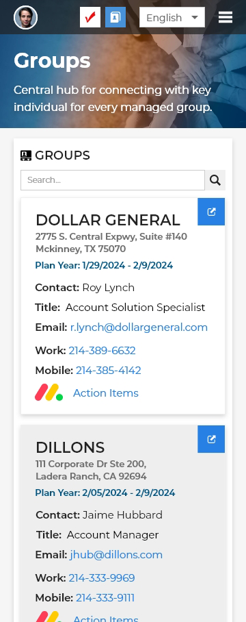
BenSelect is extensive, and health insurance brokers wanted a dashboard to only view the information pertinent to them. This involved creating a way to see the enrollment status of employees per group, running reports, and viewing contact information for each group. Oh, and it’s due in a month. Simple, right?
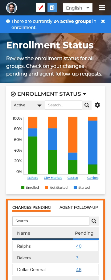
Originally I had the idea of having buckets at the top that the user can assign information to. For example, if they wanted to show how many employees haven’t started enrollment for a specific group, it would show up top. Enrollment status was always a priority so we wanted that to be one of the first things the user sees. I also really wanted to bring attention to the fact that this would be on mobile. How do we add lots of data charts to mobile and make it user friendly?
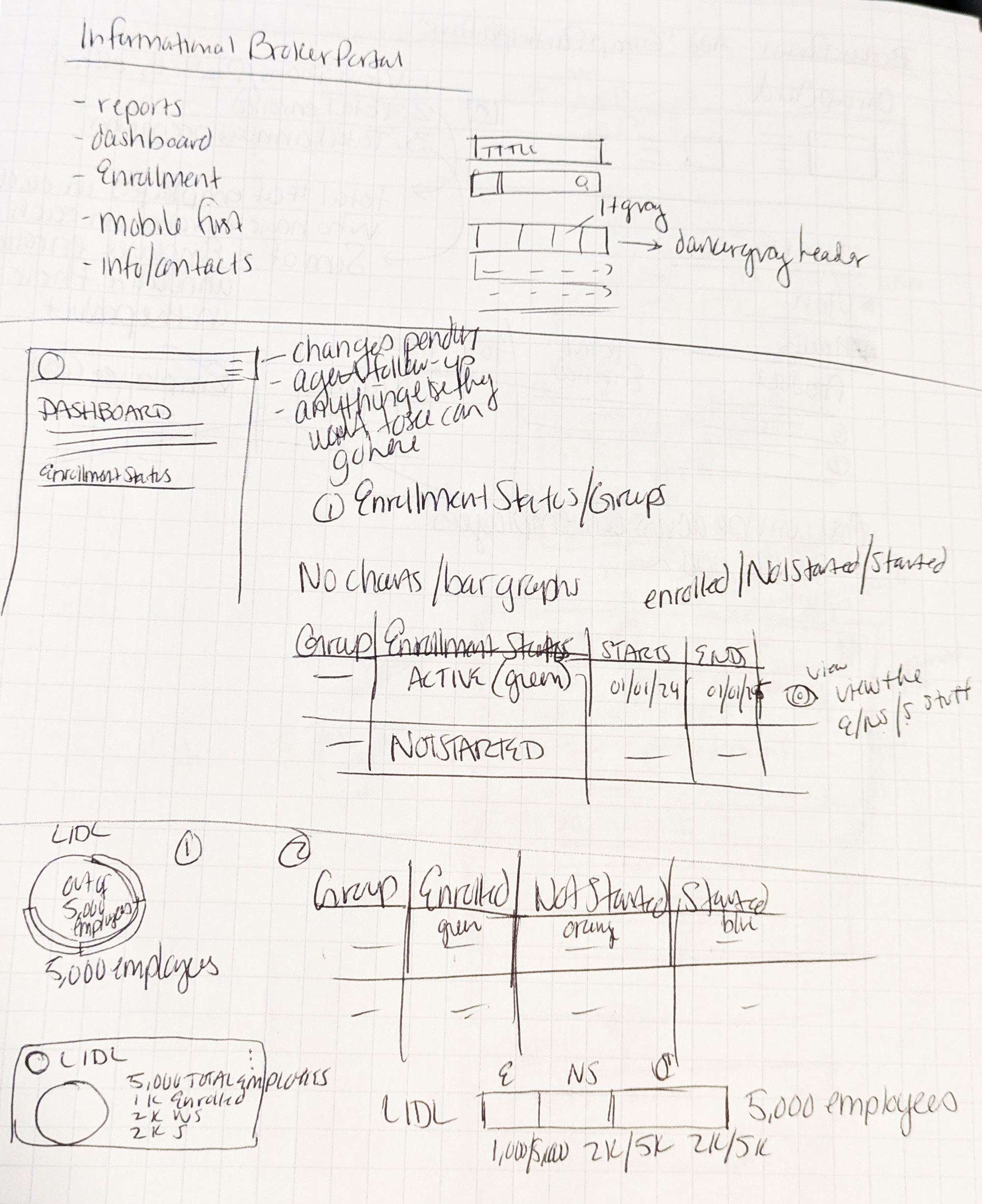
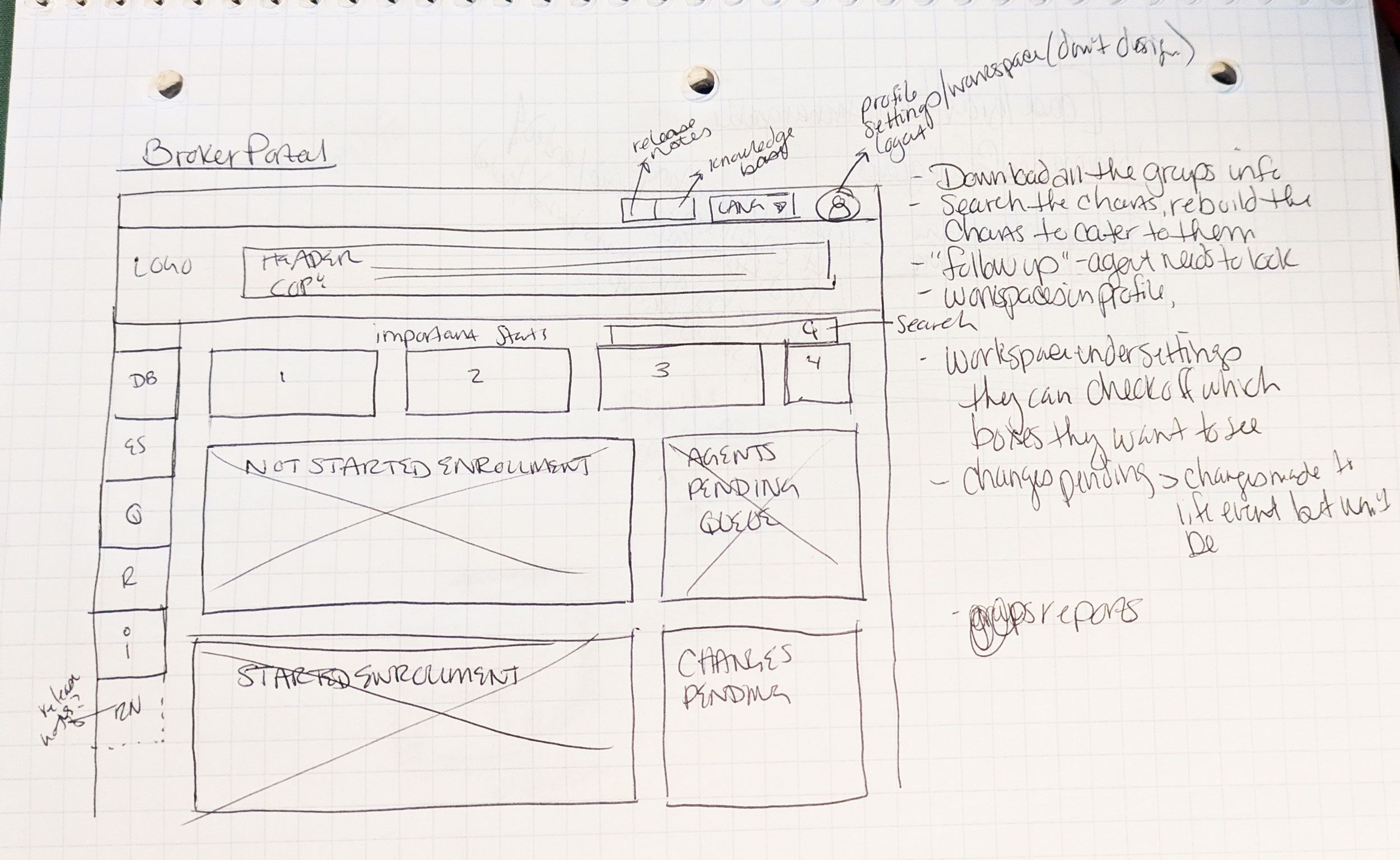
After sketching out some ideas, I wanted to create even more compact tiles, with more information integrated within, to eliminate overload. I began iterating to see what would work for the dashboard and group page layouts. This helped the business visualize the project better. Additionally, I wanted to get an idea of what mobile could look like.
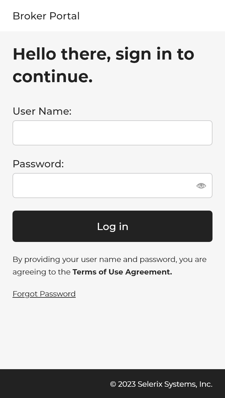
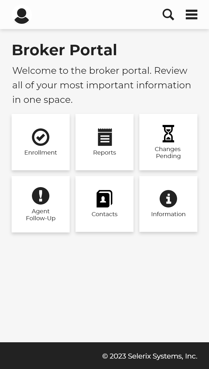
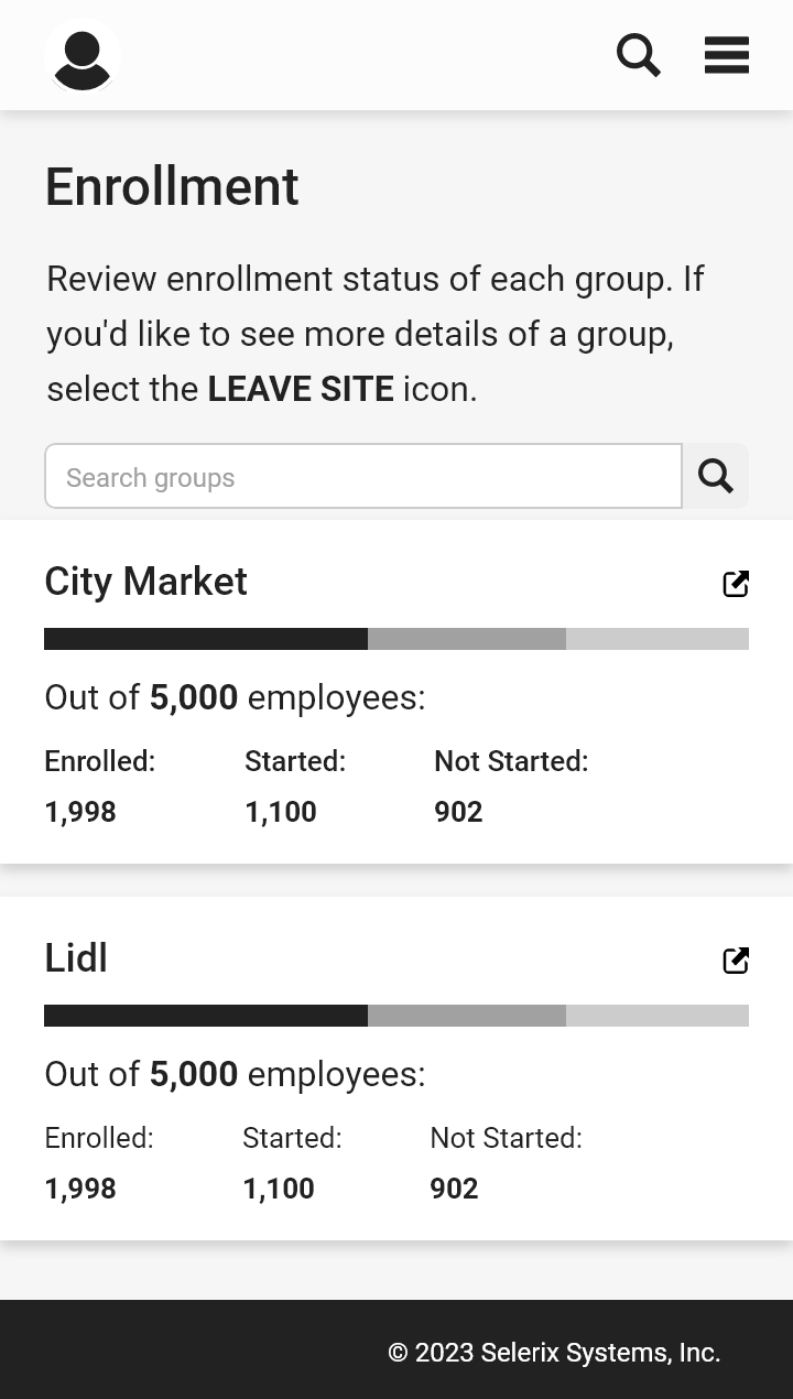
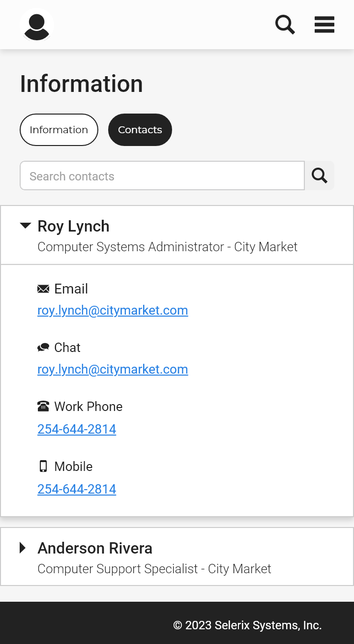
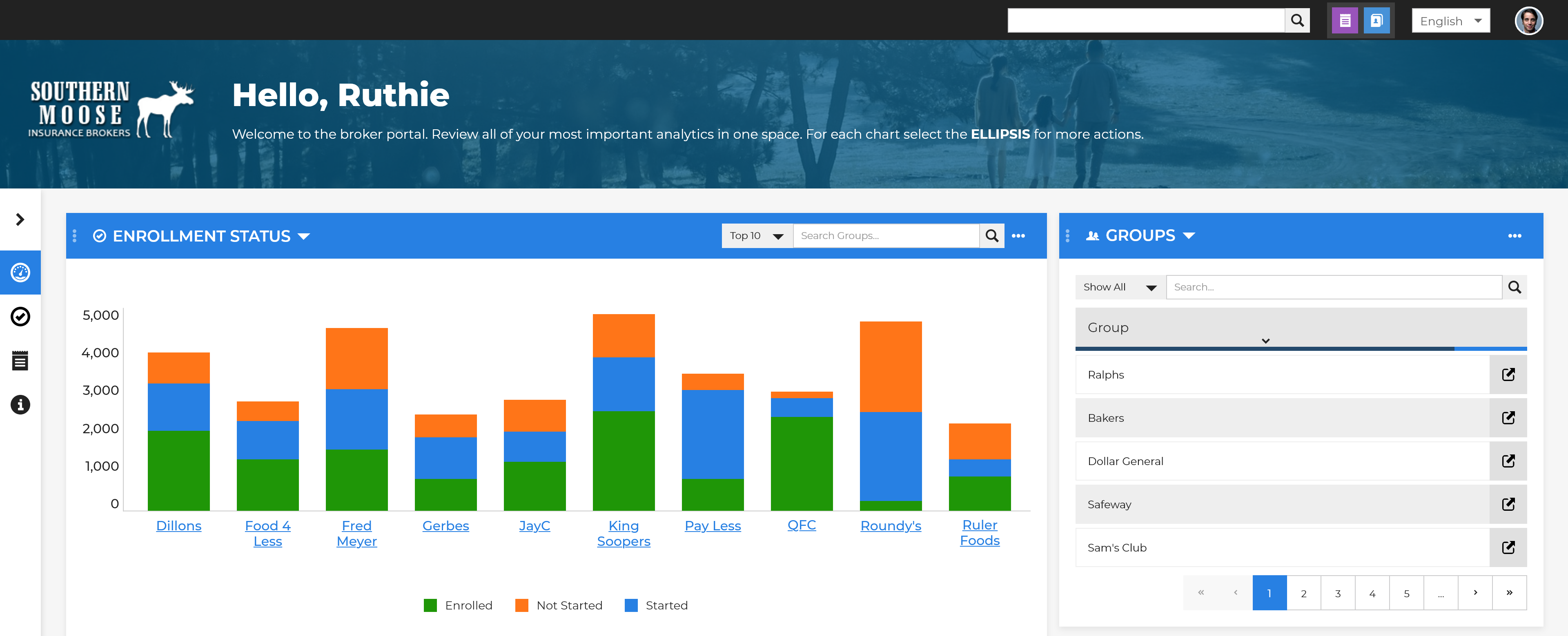
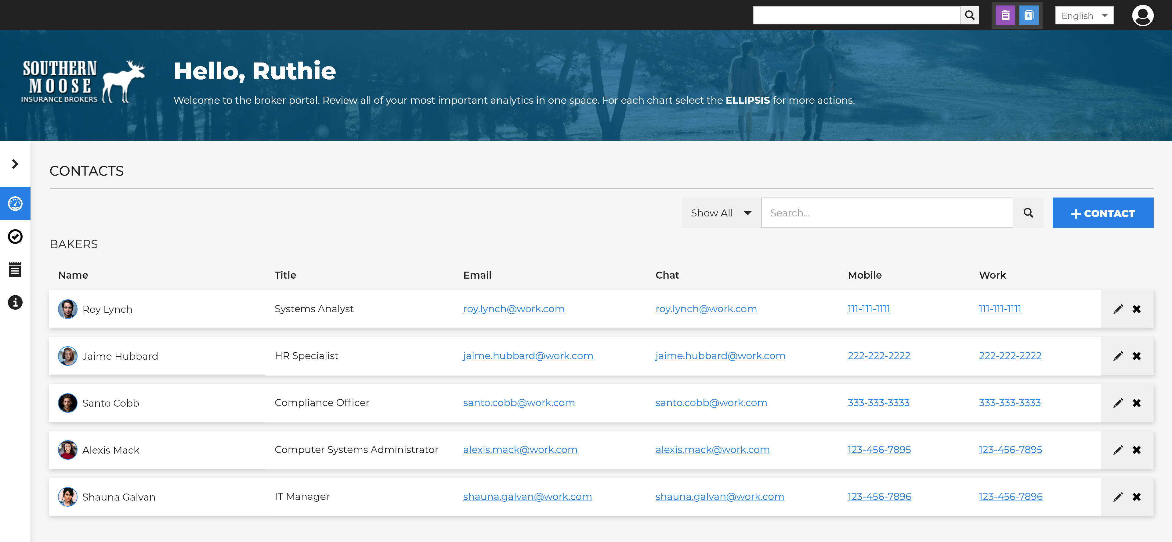
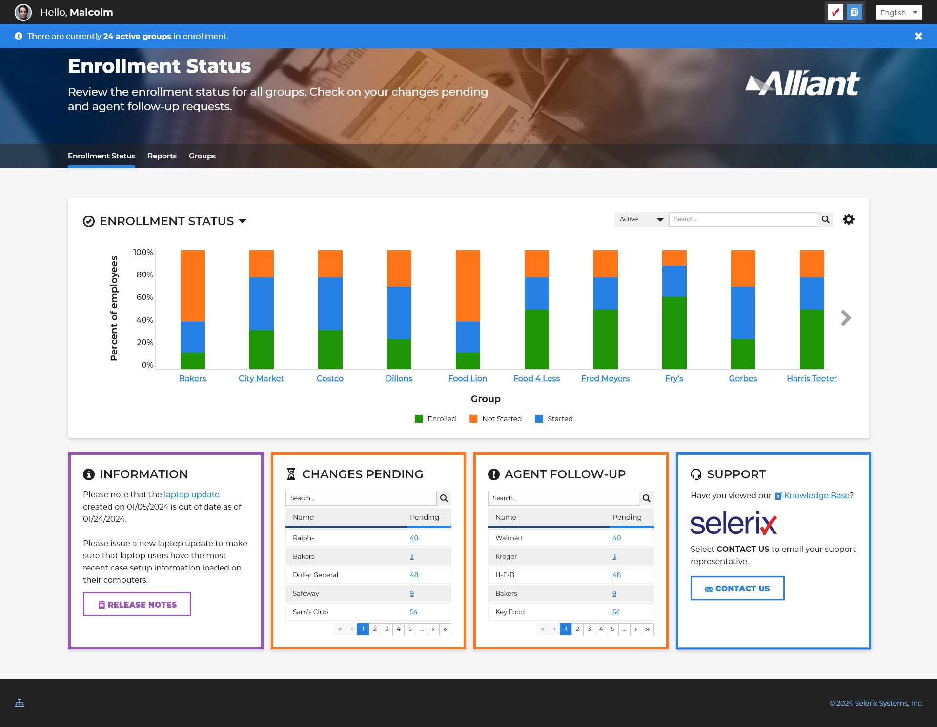
The grayscale images were a design that I envisioned if I were to completely redesign this dashboard, focusing on mobile. The color images are what I ended up with, since they didn’t want to stray too far from assets we already have. After presenting this rough draft to clients, their main concern was the number of functions on the dashboard, which is understandable—no one likes brain clutter. At this point, I wanted to collaborate with the other UX Designer on our team to gain more perspective and help create pages. They were responsible for designing the Groups section and had the idea to use color around the buckets on the landing page, while I focused on the landing page and Reports.
Enrollment status needed to be the primary focus. Brokers should be able to see each group they cover and whether they’re actively enrolled. We provided them with a clear view using a bar chart; they can select each bar to view stats for each status and scroll to the right for more groups.
There were some hiccups along the way with this one. Information and expectations of the product changed multiple times. It was difficult to really stop, sit down, and think about all the collective criteria when it often wasn’t known by stakeholders.
This case study had some tough moments. The short time frame created anxiety among team members. I love being challenged in my job; it makes things fun at times. However, when information is missing or lacking, and the timing isn’t there to fully consider functionality, more issues will arise. I understand that circumstances change, and processes might not go the way you expect. It’s the way you handle and respond to those changes that can make you a stronger designer, and I think this was one of those projects.