Case Builder
This system shows all potential inbound builds, provides visibility on the last sync date/time as a record, and offers the ability to review and map data to an existing case for updating the build or creating a new one.
Based on discussions with multiple users who would find such a system useful, a user story was developed:
Global: As a case builder, I need to access a global dashboard to integrate with one or multiple APIs, showing all potential inbound builds. I should be able to see indicators that confirm the connection is operational and view the last sync date/time.
Acceptance Criteria: The case builder can access the global dashboard, connect to specific integrators, confirm the connection is active, and see the last update time stamp.


Local: As a case builder working on a single case build, I should be able to view an integration dashboard to map data to the case. This includes job class, locations, rate groups, and plan eligibility, with options for one-to-one, many-to-one, or one-to-many mappings. This screen should show the status of the connection, all incoming notifications for changes, and the ability to approve or decline pending changes.
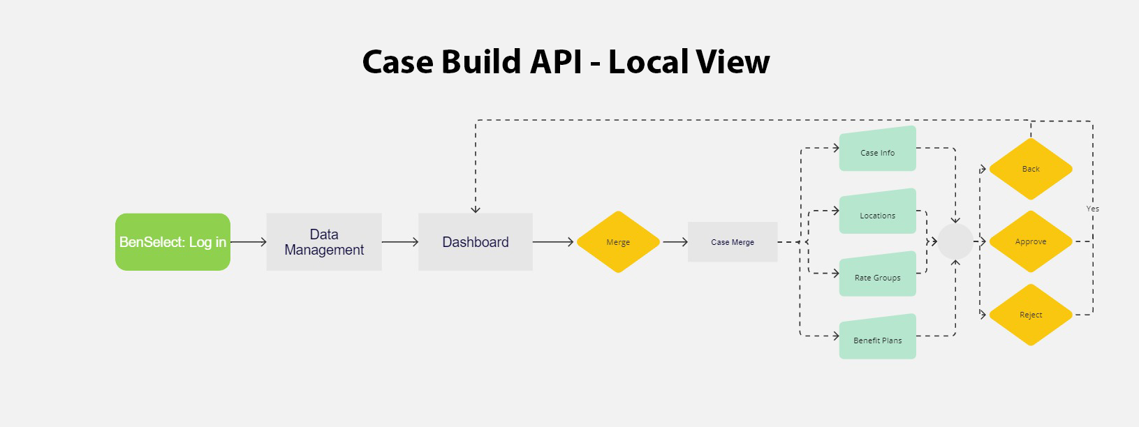
I worked with the UX Architect, product Owner, and VP of Product Development and Management. With their help, I knew I needed to lay out the entire process so that we could all see the functionality from a bird's-eye view. I quickly realized I needed to break down this project into multiple pieces. This approach helped me manage the enormity of the project and focus on specific aspects
All wireframes were presented to the team to ensure that the functionality aligned with our previous discussions. I understand that things can change so maintaining alignment was crucial. There was a strong focus, initially, on the ability to select multiple mappings from two lists. I raised a question about whether this might result in information overload early on, but sometimes people need visual demonstrations to determine functionality. I devised several ideas on how this could be implemented along with rough drafts for all pages.
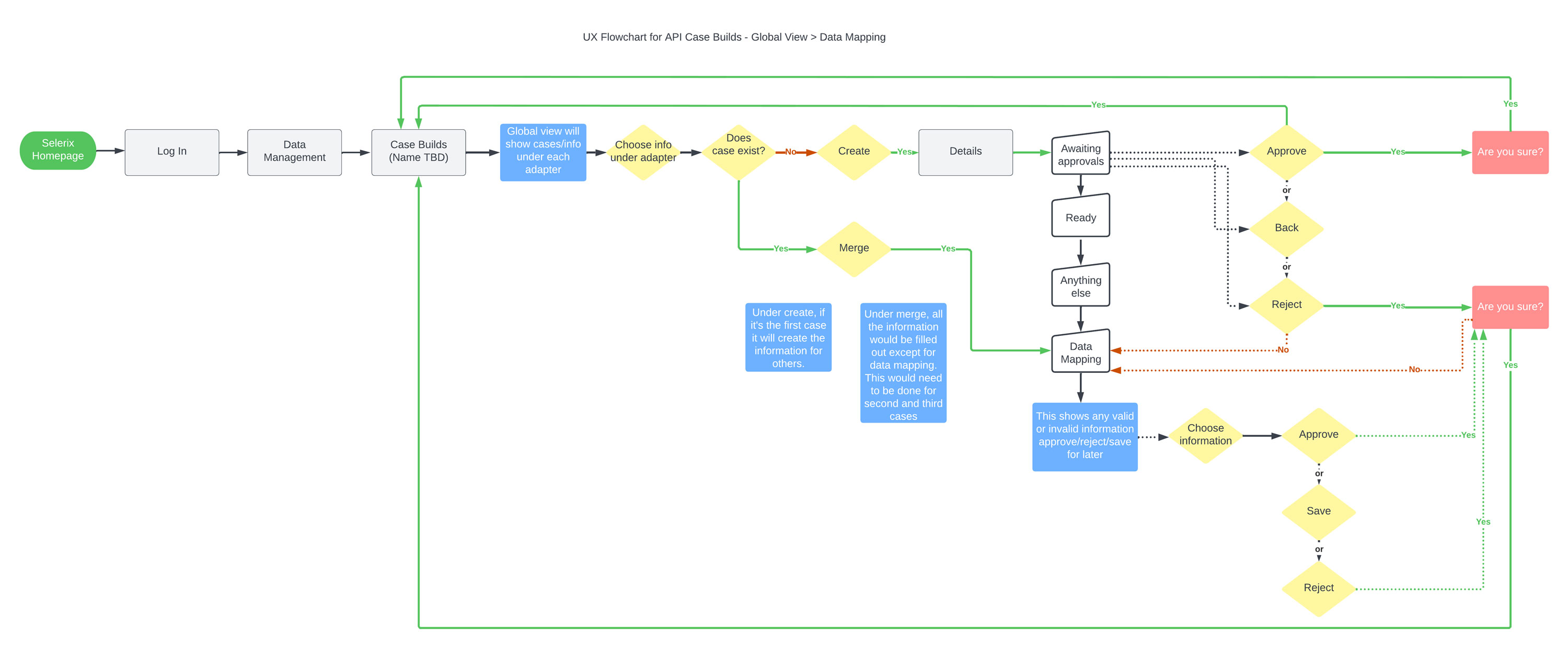
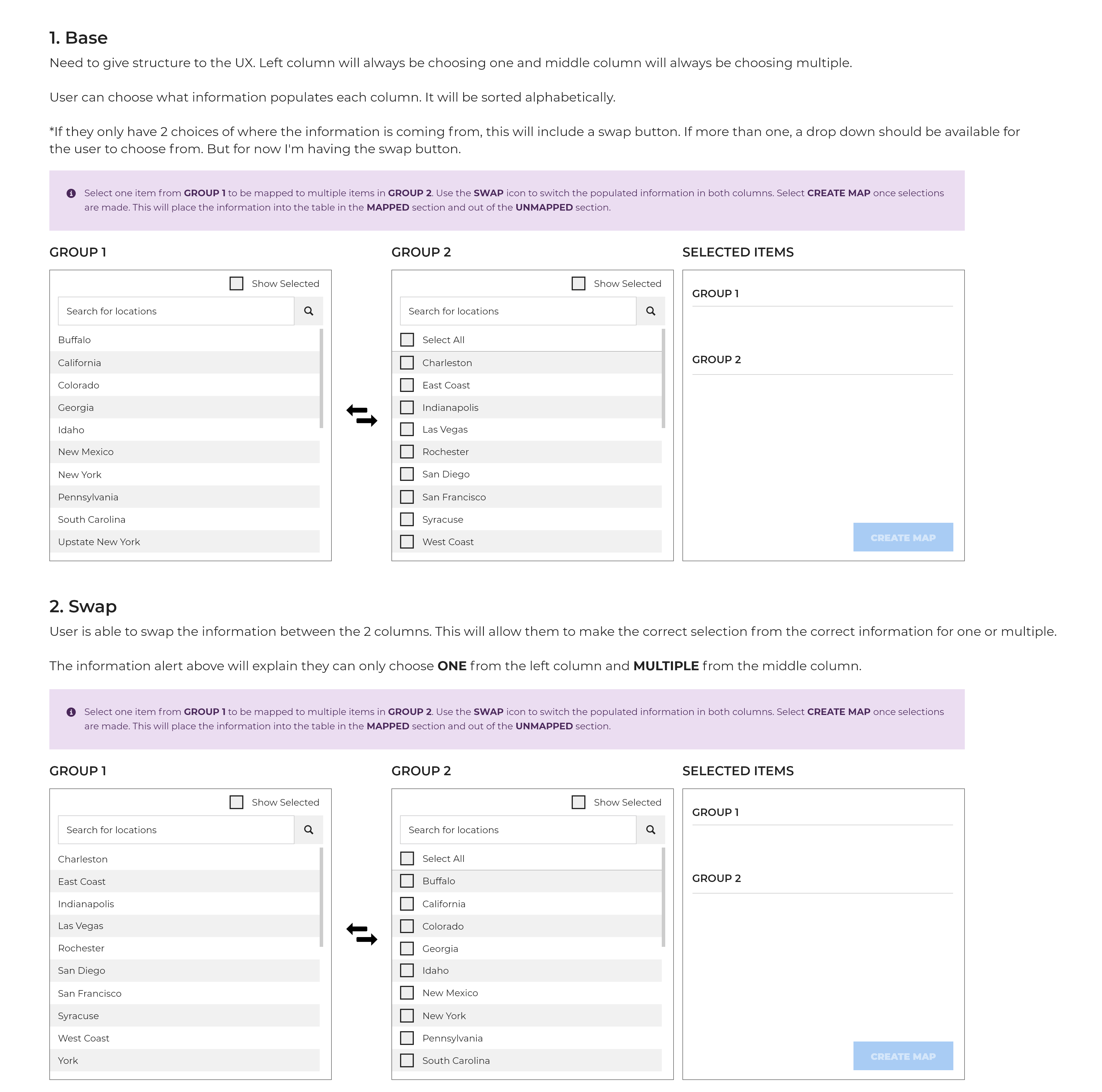
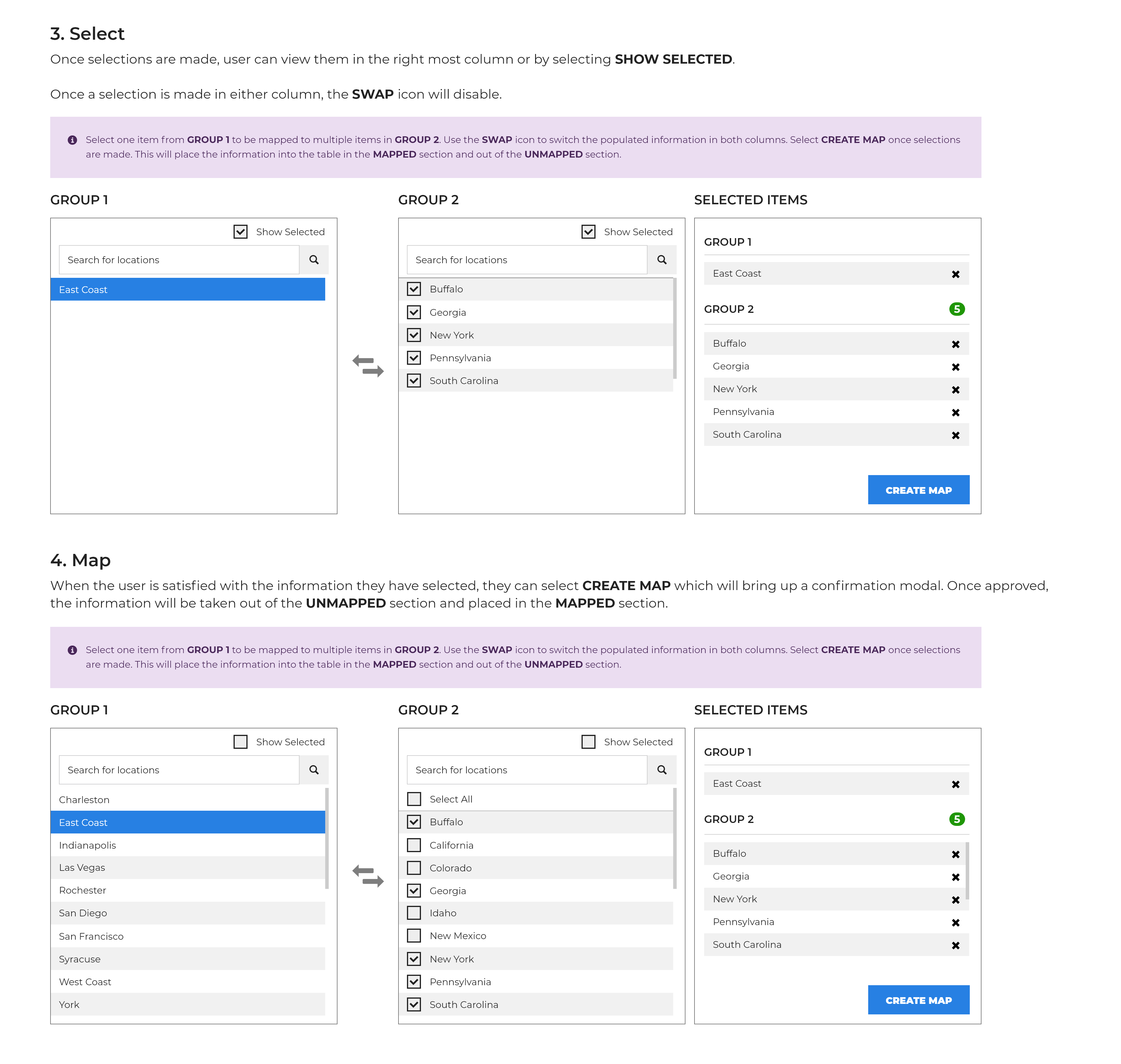
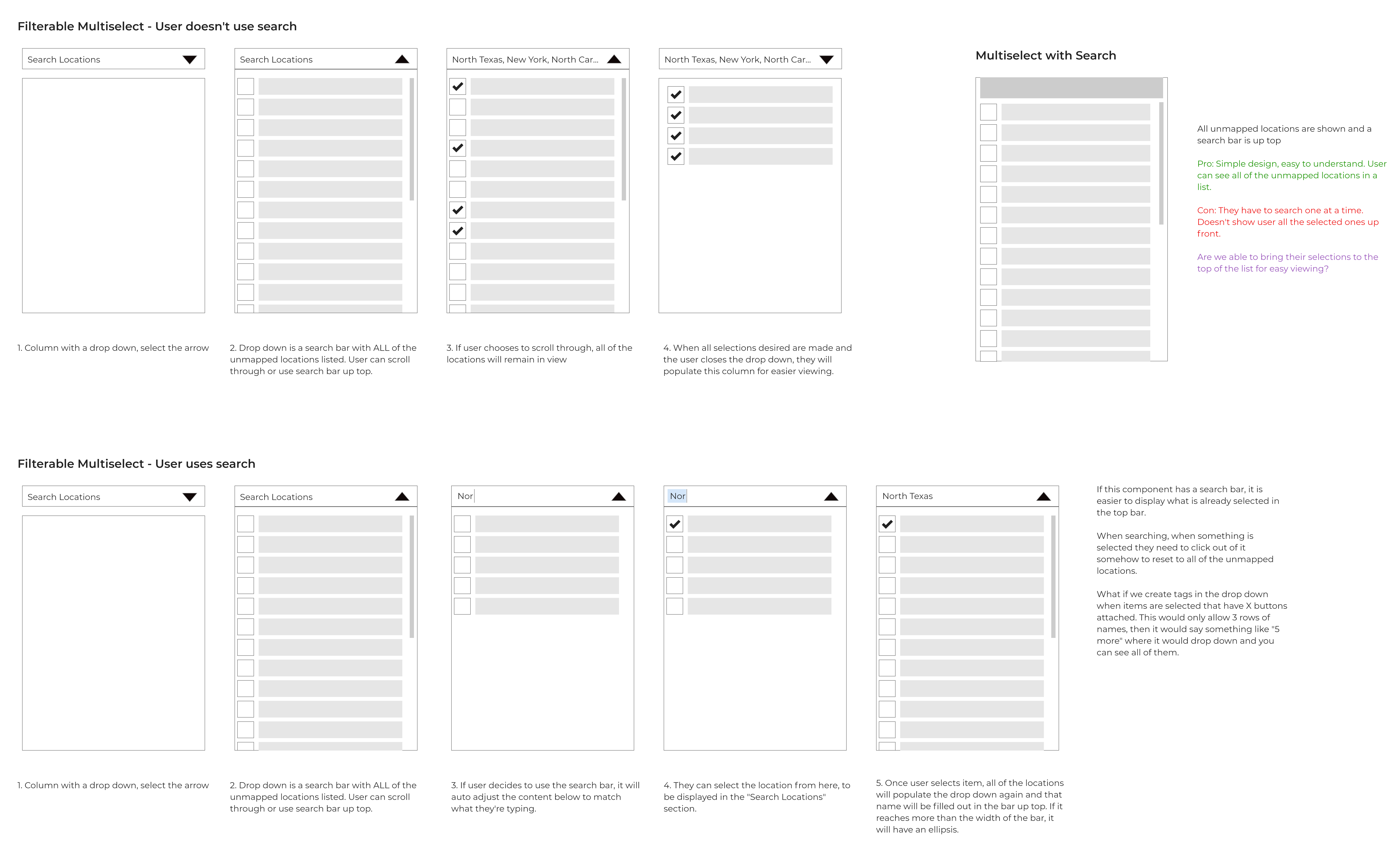
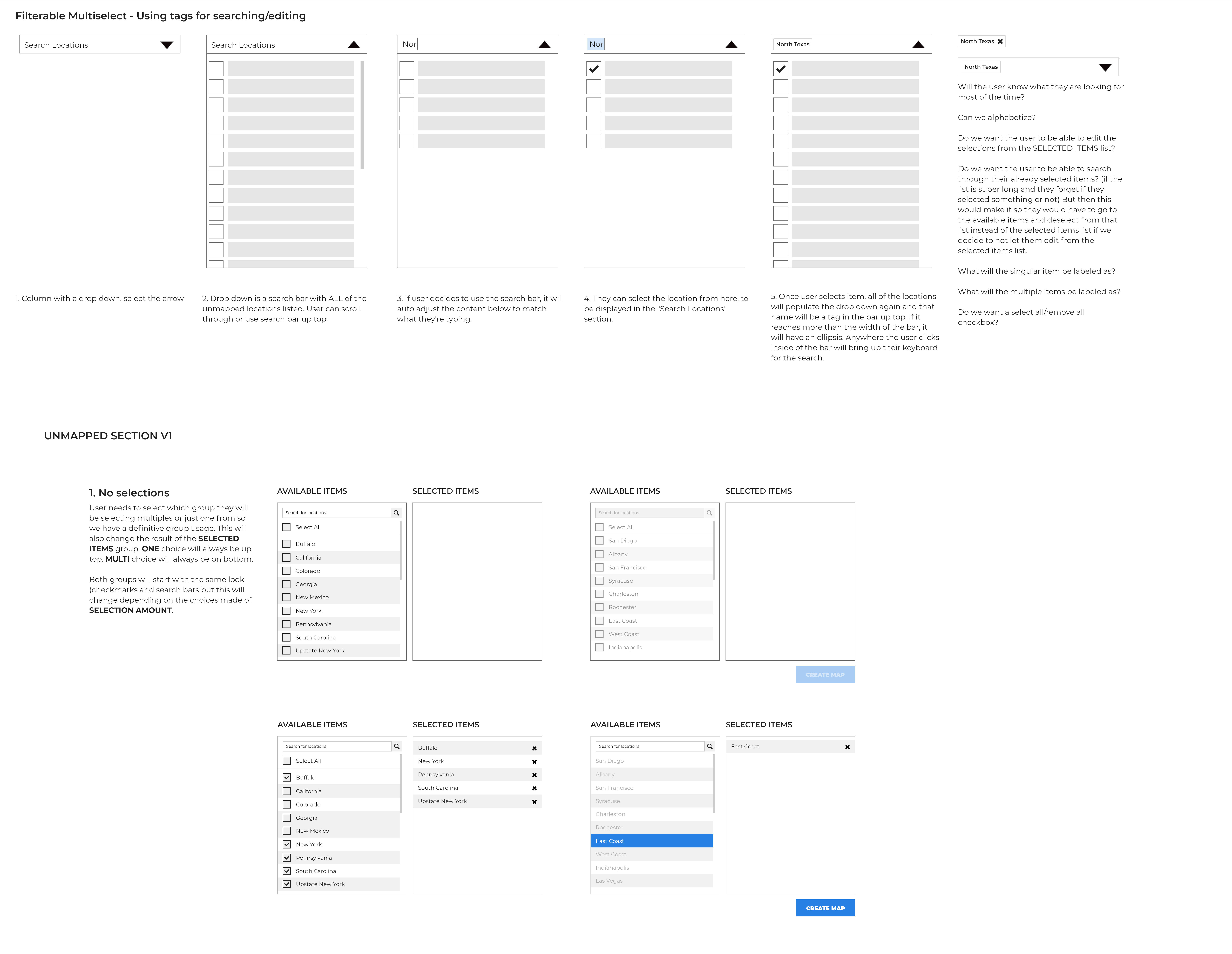
Getting approvals for each page felt like a victory - let's bring this to life! Many iterations, meetings, and cups of tea led to this moment. The final designs resemble what we envisioned, which reassured me that we were on the right track. More functions were added and refined along the way, but that was to be expected.
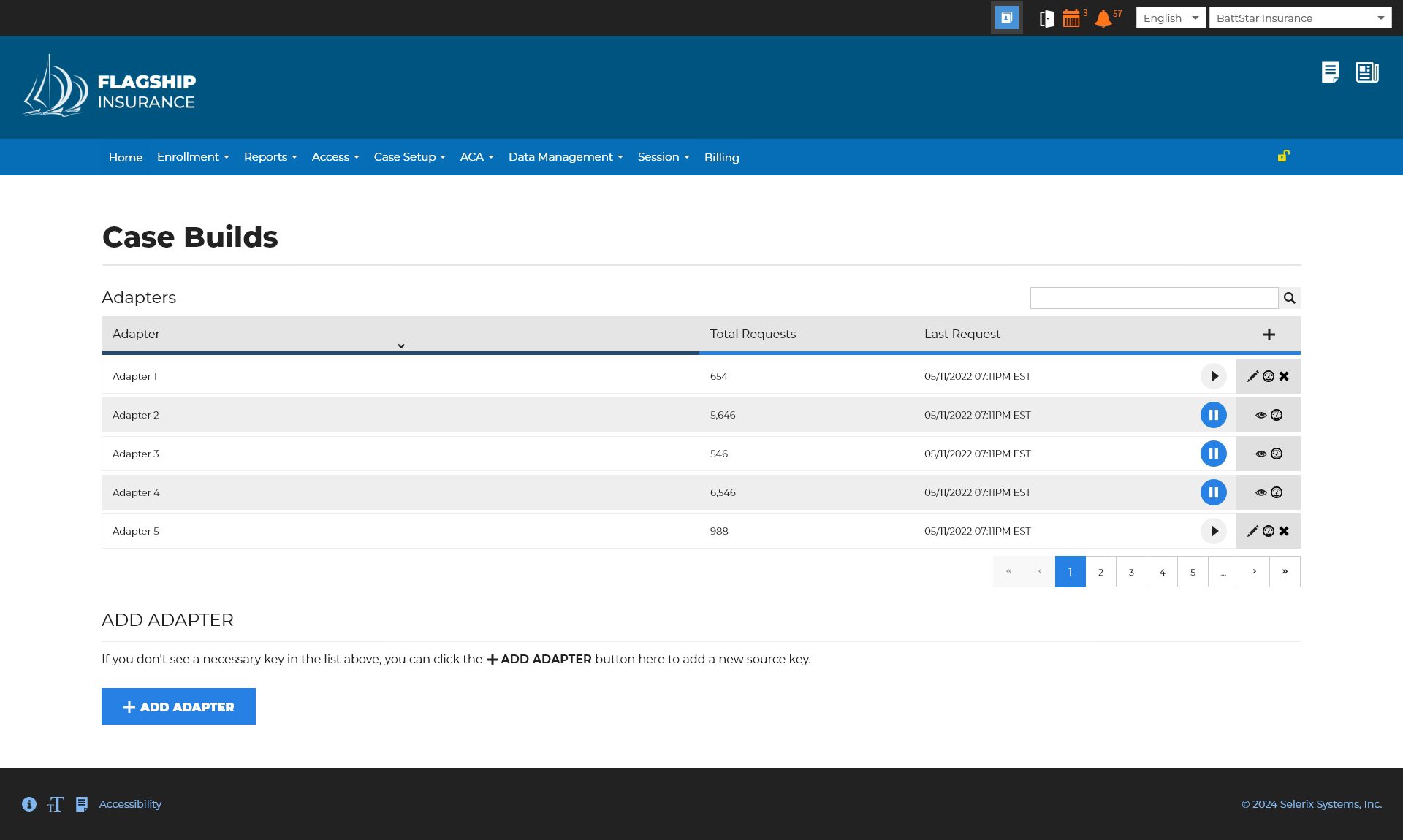
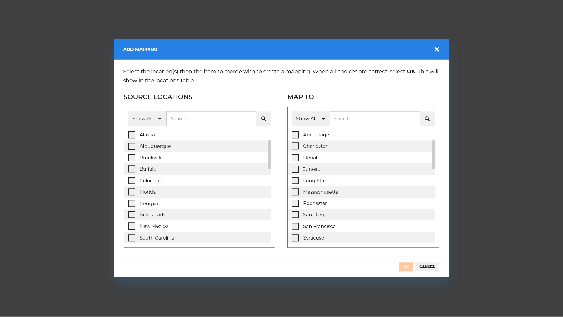
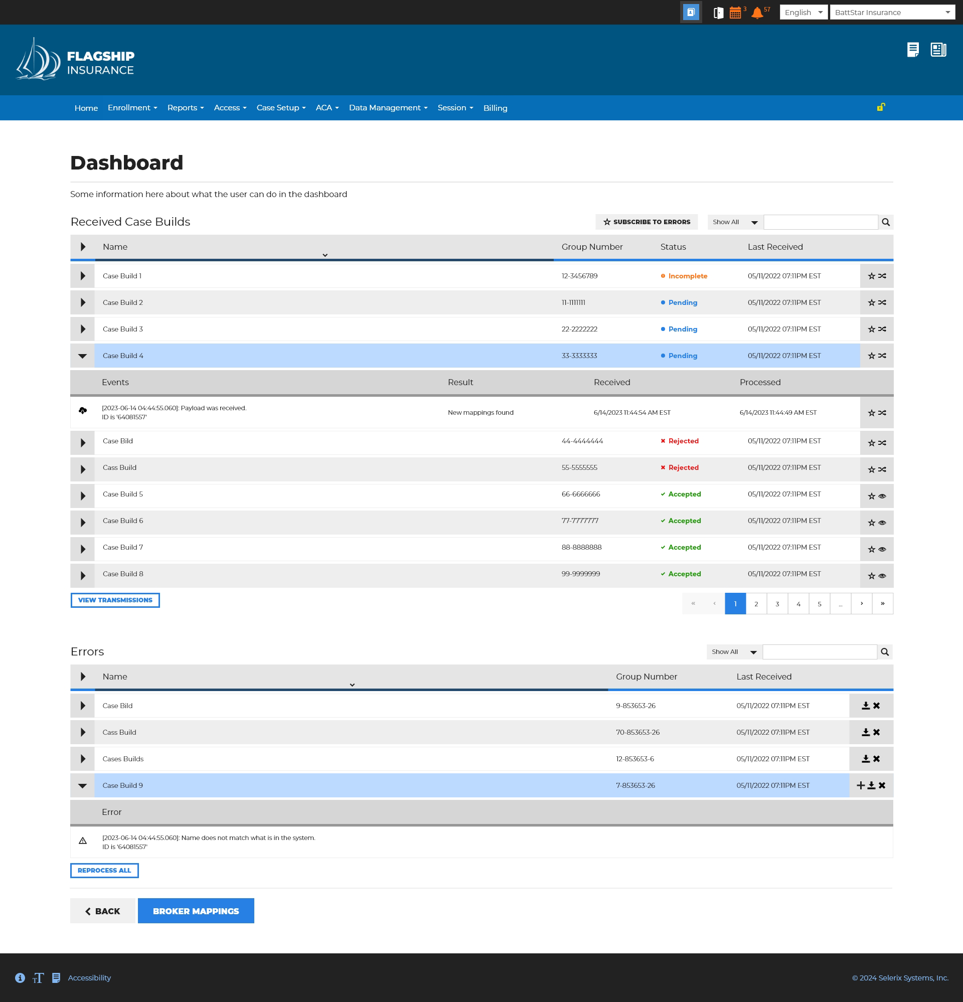
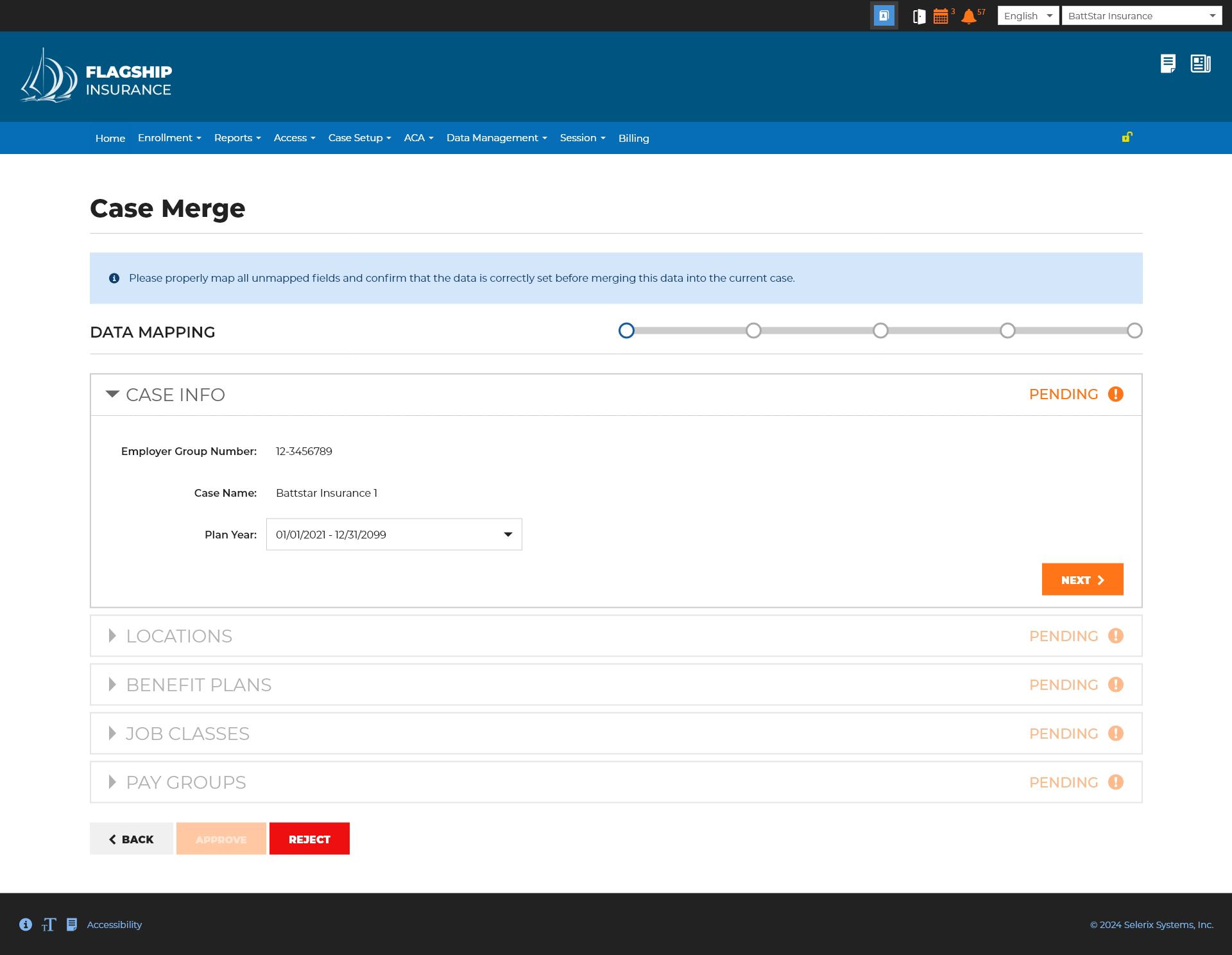
This system is robust, and it became a huge win for the company, leading to our most profitable quarter to date. Originally, the business didn't have a clear vision, but this project demonstrated that, as a small company, we can work together to achieve great things. Some highlights:
- Working with developers to navigate through the functionality and address any arising issues.
- VP's and the President making themselves available for my questions, ensuring a smooth process throughout.
- Being involved from the very beginning, from ideation to the final product.
- Having the opportunity to really stretch my designer muscles and brain by asking: "How can we make this better?" and discussing these questions with the team.