Employer Dashboard
For BenSelect (a product of Selerix), Employers wanted to see information relevant to them, while also getting a better experience with our widgets. This led me to redesign our standard dashboard to be more functional, informational and helpful.
By speaking with our customers, we learned that there wasn’t an easy way to view content requiring action from the Employer. This is what the dashboard previously looked like:
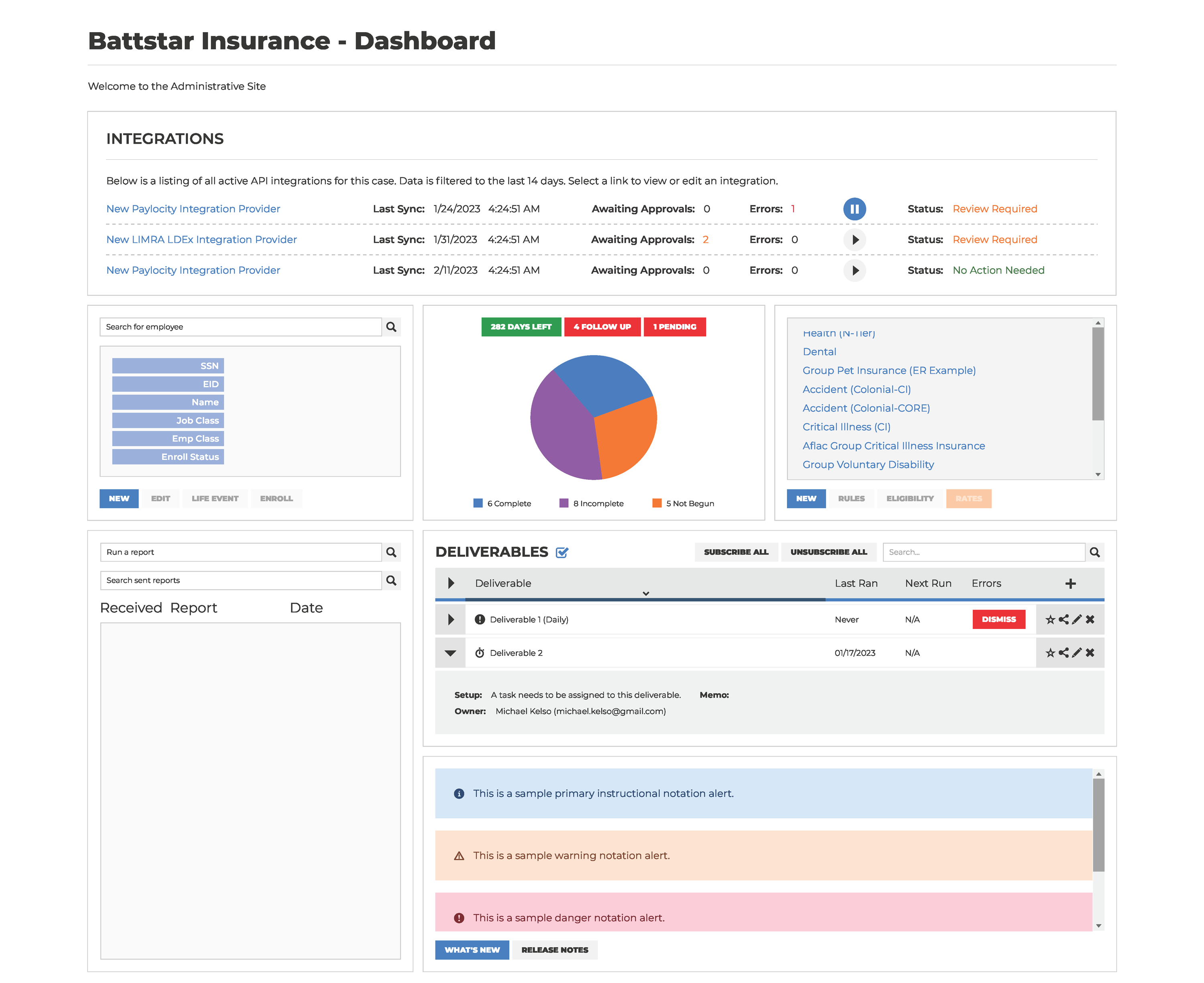
We can see some useful information, such as the deliverables and an employee search. However, the pie chart is confusing; if I weren’t involved with this system, I wouldn’t understand what "282 Days Left" means - days of what exactly? The “4 Follow Up” and “1 Pending” buttons are so small that they might appear related to the pie chart. I considered a way to bring that information into the spotlight while also providing more detail.
I wanted to start focus on improving some of the outdated widgets we had in the system. This is the improved employee search:

This retains the same functionality as the original: allowing the Employer to quickly search, create new entries, edit existing ones, or enroll within the same widget with improved readability.
Let’s take a look at the Open Enrollment widget:
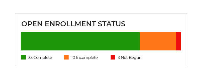
It’s clear what this is for with the large header, and it’s easy to view the status of employees within open enrollment. On desktop, hovering over each section reveals a popover displaying the percentage of employees. On mobile, the user can click anywhere on the bar to see a popover with all of the status percentages.
I wanted to create a more in-depth view of “Follow Up” (questions employees have that need answers in order to proceed with enrollment) and “Pending EOI” (e.g., when someone changes their last name and needs approval). The “Documentation” tab was added recently, it is necessary to approve documents uploaded by employees for enrollment.
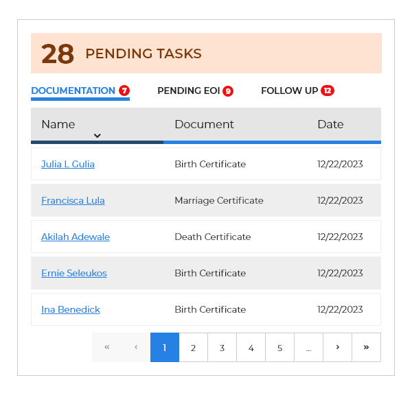
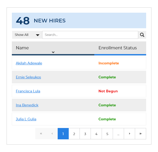
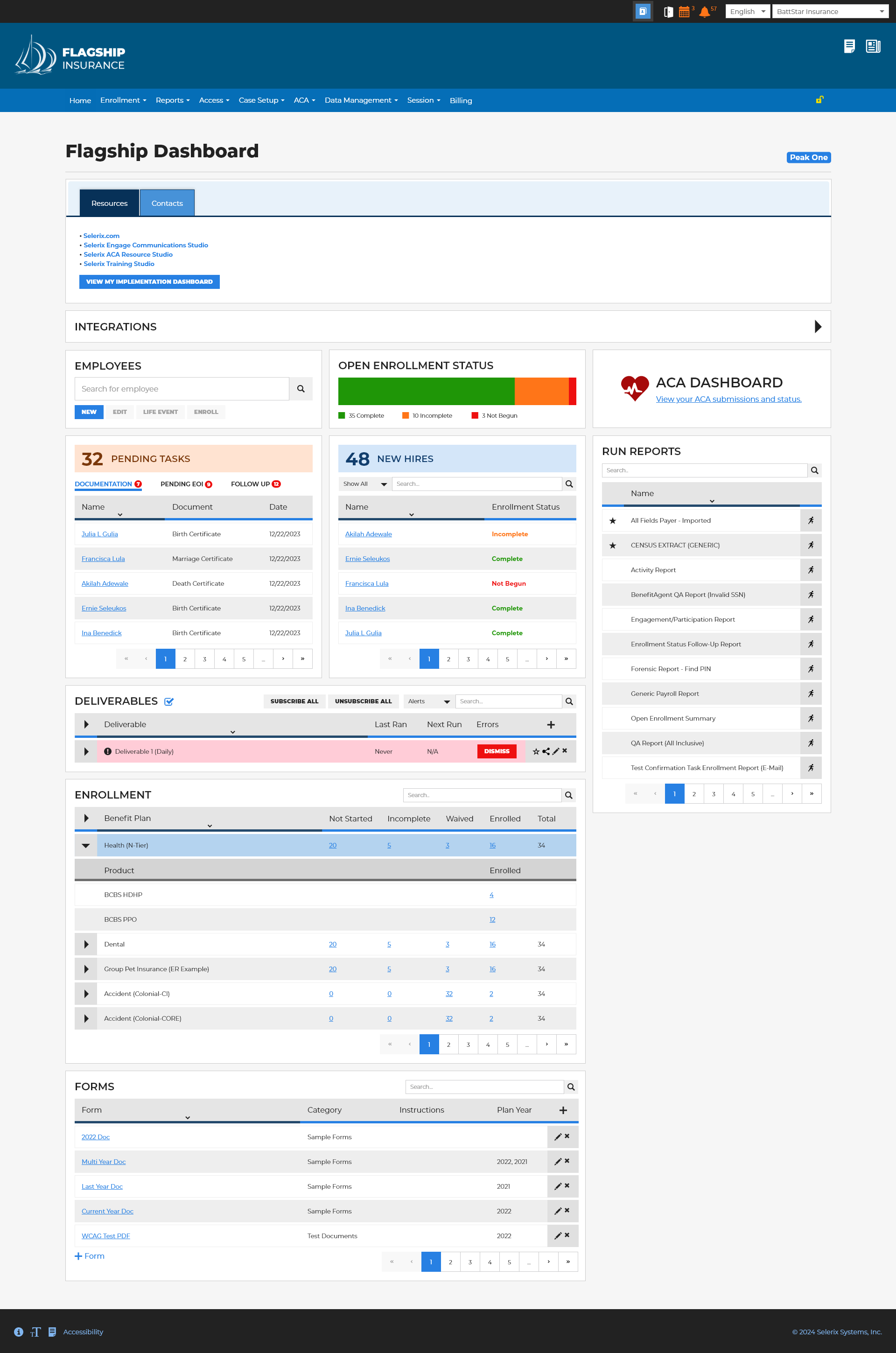
This type of design allows for more flexibility in the widgets themselves, as well as room for additional items the business might want to add later. Accessibility in the footer was lacking because the original blue color we used wasn’t compliant. I suggested making that change across all of our products to ensure readability, and it is now standard.
The business recently brought this layout to a conference, and the initial feedback was great. Users loved the quick views of the tasks they needed to complete and the minimal navigation required to access certain areas of BenSelect. I’m excited to see real use cases and to iterate on the design, making changes to create an even better experience based on the feedback.